Data is everywhere. It drives many aspects of our day-to-day lives. Use this resource to learn about the different types of data and some ways of displaying it.
Collecting and processing data
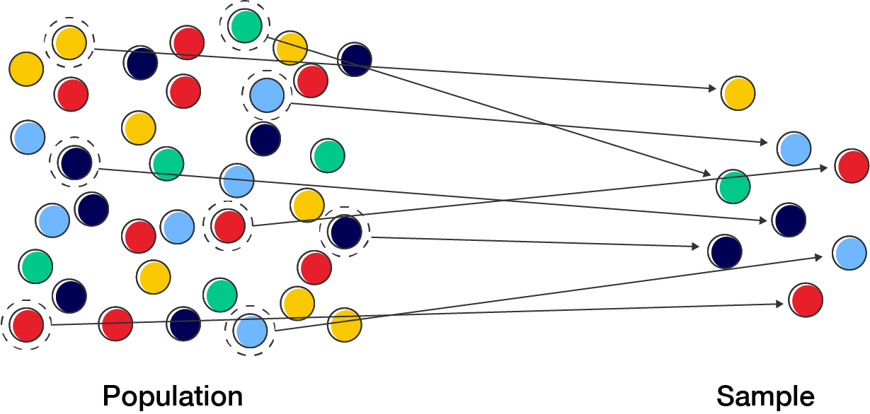
To study the relationships between variables (a characteristic, number, or quantity that can be measured or counted), you need to collect information or data. The relationship can apply to a whole population, which is the total group of individuals or items being considered. Usually, we only take a small subset of this population, called a sample.
Once we have the data, we can calculate numbers from the sample to get statistics. When we calculate number from population data, we get a parameter.
Types of data
Data can be classified as either:
qualitative – categorical or non-numerical (e.g. blood type, occupation, colour)
discrete data – data that can only take on certain values or be counted (e.g. the number of children in a family)
continuous data – data that can take on any value or be measured (e.g. height).
Exercise – classifying data
Classify each of the following as qualitative or quantitative data, including whether they are discrete or continuous if they numerical.
Hair colour
Temperature in the fridge throughout the day
Height
Movie genre
Students in a class
Language spoken
Weights of babies born on a certain day
Number of eggs laid by a chicken
Distance travelled to work by RMIT staff
The make of car driven by RMIT students
Qualitative
Quantitative, continuous
Quantitative, continuous
Qualitative
Quantitative, discrete
Qualitative
Quantitative, continuous
Quantitative, discrete
Quantitative, continuous
Qualitative
Displaying data
A summary table of your data is one way of presenting results, but sometimes, it is important to turn it into a visual format like a chart or graph.
Visualising data helps people to understand the information quickly by showing patterns and trends that might be hard to spot in a list of numbers. This makes it easier to share findings with others and helps in making smart decisions based on the data.
The way you chose to present data can depend on the type of data you have collected.
Qualitative data is often represented using a bar chart or a pie chart.
Quantitative data is often represented using a frequency bar chart called a histogram.
There are many other ways of presenting data; these are just some basic forms.
Example 1 – displaying data
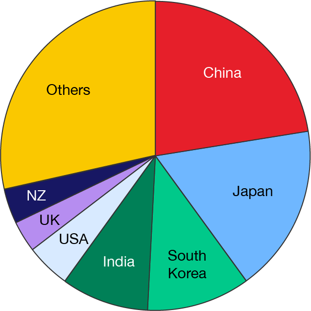
The table shows the percentage of Australian imports from various countries. Represent the data with a pie chart.
Country
Imports \((\%)\)
China
\(22\)
Japan
\(20\)
South Korea
\(8\)
India
\(8\)
USA
\(5\)
UK
\(4\)
New Zealand
\(4\)
Others
\(29\)
For a pie chart, the size of the wedge corresponds to the proportion of \(100\%\). The data we have is already in percentages, so we just need to accurately represent them in the chart.
These days, it is uncommon to prepare pie charts by hand. We usually use graphing software like Microsoft Excel to help, but it can be done.
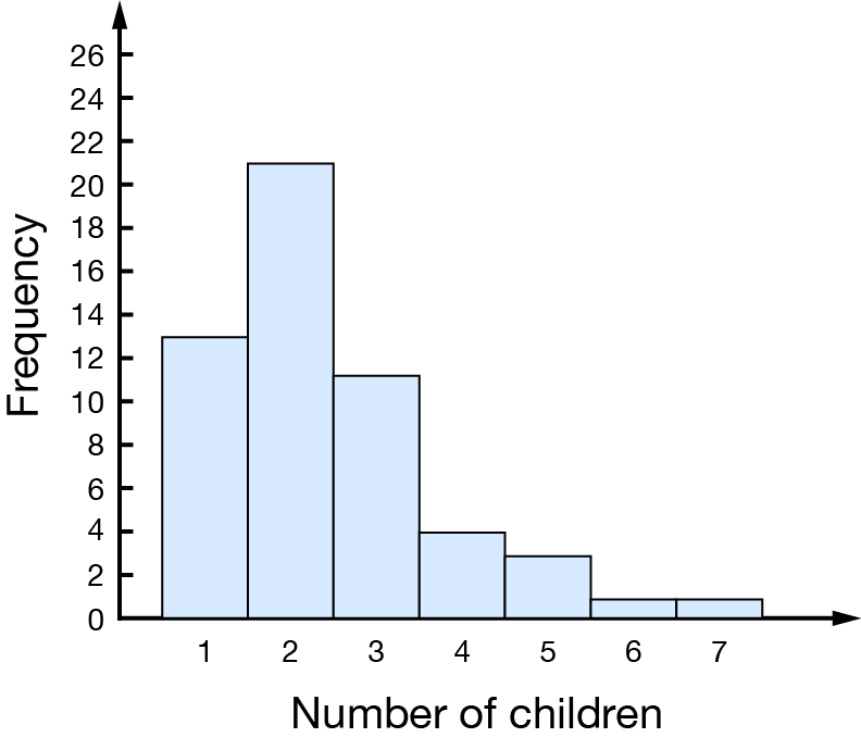
A group of school students were surveyed to find the number of children in their families. Represent this data using a histogram.
Number of children
Frequency
\(1\)
\(13\)
\(2\)
\(21\)
\(3\)
\(11\)
\(4\)
\(4\)
\(5\)
\(3\)
\(6\)
\(1\)
\(7\)
\(1\)
Total
\(54\)
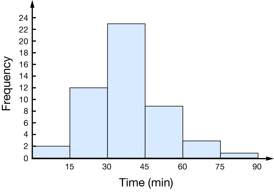
A histogram is a graph with the variable on the horizontal \(x\)-axis and the frequency on the vertical \(y\)-axis. Here, the number of children will be shown on the \(x\)-axis. Each category (e.g. \(1\) child, \(2\) children, \(3\) children, etc.) is represented by a vertical column.
Exercise – displaying data
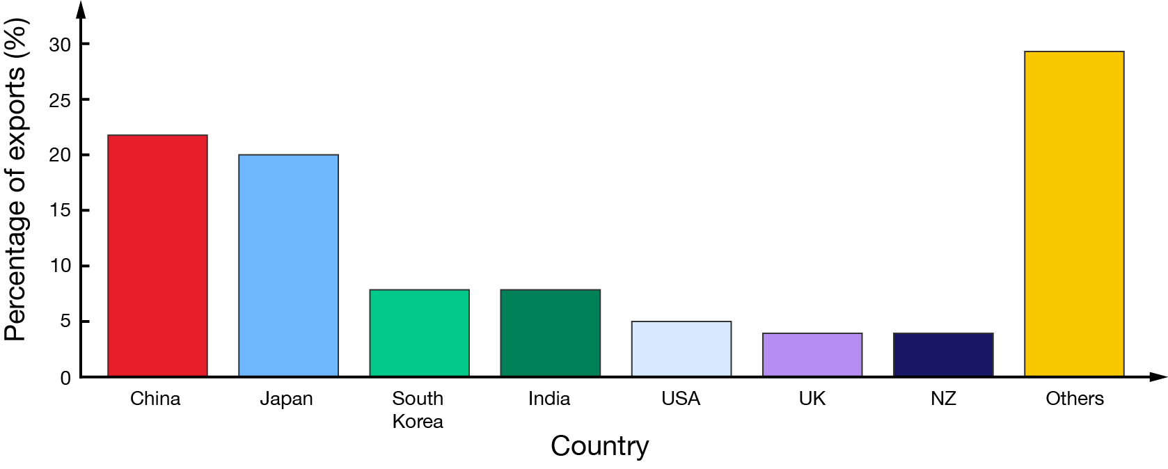
Represent the data from Example 1 – displaying data in a bar graph.
A group of employees recorded the time that it took them to travel to work on a particular day in a table. Represent this data using a histogram.